When Norway’s national soccer team first experimented with kits that used a font inspired by the runic alphabet, an ancient Scandinavian written language used by Vikings, it was too hard to read.
Characters on Norway’s 2024 jerseys were jagged, sharp, and not easily discernible. On the country’s home kits, they were beveled and even more difficult to make out, baffling plenty of first-time viewers. Plus, they didn’t adhere to FIFA’s rules for the typography of World Cup kits to be “clearly legible and distinguishable from a distance” for players, officials, spectators, and the media.
So for the 2026 World Cup, Norway’s first appearance in the tournament since 1998, Nike, which makes their kits, helped the team design a new font that balances readability with heritage.
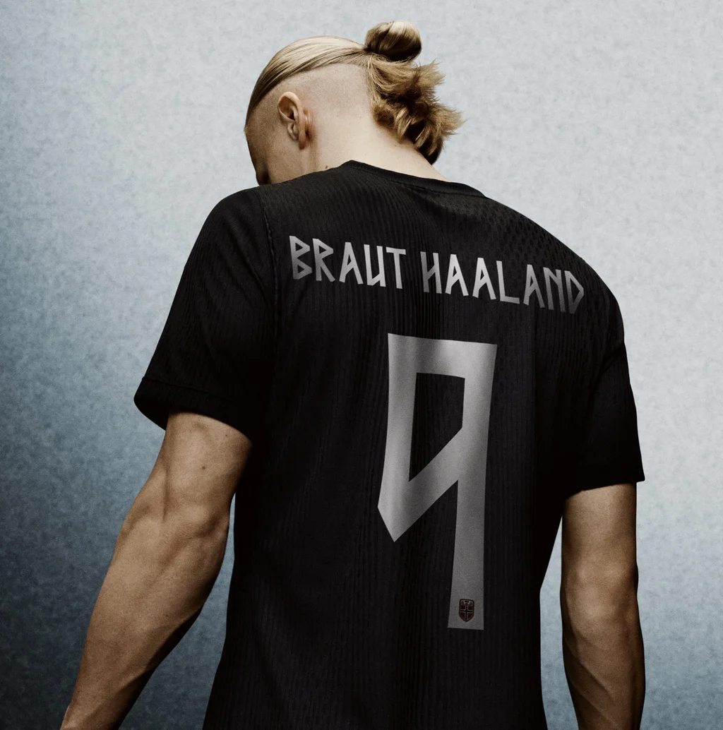
The typeface used for Norway’s uniforms is called Taakeferd, a Norwegian word meaning “journey through the fog.” It nods to the country’s return to the World Cup for the first time in 28 years.
FIFA regulations also specify the sizing and placement of player names and numbers on uniforms, and they must be in Latin characters, though they can use diacritical marks, like accents and umlauts.
With Norway headed to the quarterfinals Saturday against England, it’s clear Taakeferd passed the test. The typeface is composed of vertical or diagonal lines, which makes for distinctive, triangular shapes on curved Latin letterform in letters like B and R.
The Nike design team designed Taakeferd in partnership with the Norwegian Football Federation; the goal was to create kits that felt unmistakably Norwegian.

Norway’s home kit is based on the country’s flag—a red, white, and blue Scandinavian cross—and its away kit is all black. A Viking-style font for the names, numbers, and “Norge” written on the inside back collar sure helped.
Nike says the typeface was designed after extensive research.
“We studied the Runic alphabet’s angular strokes and sharp geometry, then adapted those design lines to work within the modern Roman [Latin] alphabet, preserving the runic DNA, while keeping the typography clean, legible on broadcast, and unmistakably contemporary,” a spokesperson for Nike’s design team tells Fast Company.
“Numerous iterations of most letters and numbers were created before landing on the final version, and readability was clearly a driving constraint through that process, not an afterthought,” the Nike spokesperson says. “The result is a custom typeface that lets every player wear a piece of Norway’s history on their back.”
Runic alphabets were used by Nordic and other European peoples until about the 16th or 17th centuries, and their tall, angular letterforms still inspire type designers today. Noto Sans Runic is an open source Google font and sans-serif typeface for texts in the historical European Runic script, while contemporary typefaces like Notdef, Nordic, and Norse approach runic-inspired shapes in their own ways.
For Norway’s national team, Taakeferd keeps the runic style intact with sharp angles and unique characters you won’t find on any other team’s jerseys, translating this typographic history for the rest of the world.
Related Posts
Mamdani has backers on Wall Street. It’s their bosses who are boosting Cuomo for NYC’s next mayor.
Zohran Mamdani has won the hearts of some Wall Street…

Roblox accused of being a ‘hunting ground’ for child predators as legal firestorm against gaming giant intensifies
In this photo illustration the Roblox logo seen displayed on…
We homeschool our 4 kids and don’t plan on going back to public school. We aren’t against it; it just wasn’t for us.
The author, his wife, and their four kids are more…