There’s a good chance you have a Great Value product in your home right now: perhaps chicken nuggets in the freezer, or paper towels on your counter. The brand (Walmart’s largest private label, which launched in 1993) turns up in 9 out of 10 American households. By Nielsen’s count, that makes it the largest consumer packaged goods brand in the United States—bigger than Coca-Cola and Pampers.
Until now, Great Value’s packaging has been designed to telegraph low prices: Walmart estimates that these products save the average family more than 35% annually compared to national brand equivalents. Its white background, blocky letters, and straightforward blue logo were meant to signal a no-frills brand with products that are good for your wallet.
But in focus groups, Walmart customers expressed that while they appreciate how much money they save, they’re not necessarily proud to have the products out when company comes over. “They want to be proud to buy Great Value,” says Scott Morris, SVP of private brands, food, consumables, and manufacturing at Walmart U.S. “They want to be proud to have it in their home, to share it with their friends and family.”
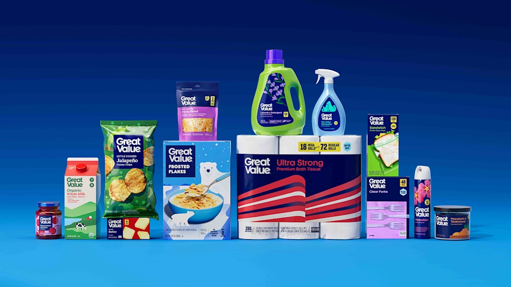
Walmart has heard its customers. Today, the biggest retailer in America announces a comprehensive redesign of Great Value, the first full refresh of the brand in more than a decade. It’s a big task, involving the overhaul of nearly 10,000 food and consumable items across more than 100 categories, that will take place over the next 18 months.
The rise of the “shoppy shop” dupe
The timing of the rebrand is apt. Inflation has pushed grocery prices up across the board over the past few years, and consumers who might once have defaulted to Whole Foods or a specialty grocer started filling their carts at Walmart, often for the first time.
On the company’s February earnings call, Walmart CFO John David Rainey noted that shoppers earning more than $100,000 a year were among the biggest contributors to growth in the quarter—due to those broad economic headwinds, and to the big-box retailer’s strategic response: a deliberate effort to attract those higher-income shoppers over the past five years.
Walmart’s Great Value rebrand is part of a broader effort among retailers to make their private labels as compelling to customers as the premium national brands that sit on their shelves. Given how crowded the consumer packaged goods industry is, upscale direct-to-consumer food startups like Brightland, Fishwife, Fly by Jing, and Ghia have historically broken through online with highly branded packaging. Those brands soon landed in small, curated, upscale boutiques (so-called shoppy shops) before securing deals with big retailers like Whole Foods, Target, and, yes, Walmart.
This has influenced how the larger retailers like Walmart have designed the branding and packaging of their private-label brands, by presenting them as an affordable alternative with the same quality and shelf appeal. In 2019 Target launched Good and Gather, a food brand that stands out for its approachable, color-on-color premium branding. And discount grocery chain Aldi modernized its own private-label food products last fall.
Meanwhile, Walmart has been quietly reshaping its private-label portfolio for years. It launched a premium food line called Bettergoods in 2024 that focuses on global flavors and better ingredients, with the kind of colorful, illustration-forward branding familiar to modern consumers who might also buy upscale DTC products.
In terms of product quality improvements, last fall Walmart committed to removing synthetic dyes from all of its private-label food brands by January 2027. It’s also growing its fresh food business under the Marketside and Freshness Guaranteed labels.
The efforts appear to be paying off by driving sales among higher-income shoppers. A 2025 survey conducted by A&M Consumer and Retail Group revealed that higher-income shoppers are increasingly choosing private-label products at least in part because they look just as chic as national brands.
Great Value doesn’t have to “look cheap”
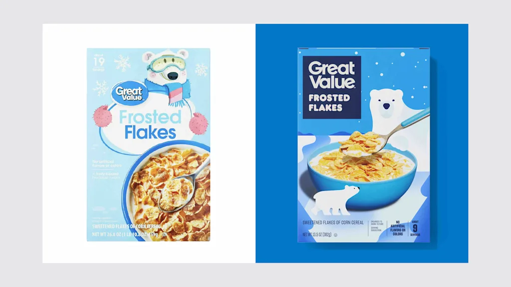
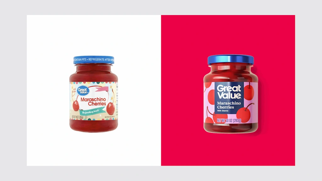
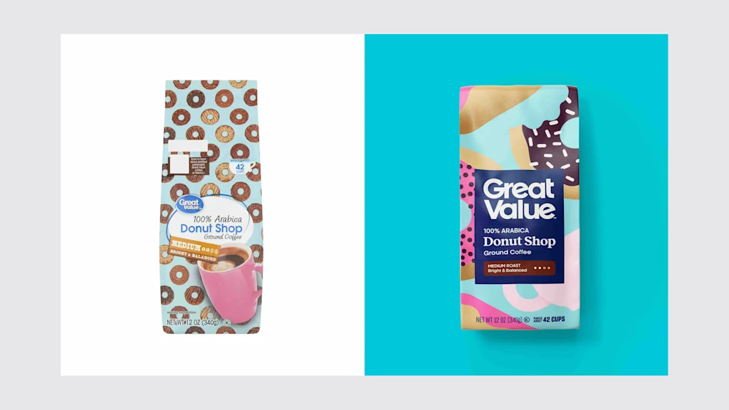
The redesign is a deliberate move to close the consumer sentiment gap between Great Value products and their look by making the packaging cleaner and more elevated, according to David Hartman, VP of creative design at Walmart.
The results follow years of consumer testing, such as at a mock store at Walmart’s Bentonville, Arkansas, headquarters, walking through shelf sets to understand how designs read in context. Customer feedback—from call centers, online ratings, and third-party testing—was collected continuously. “The feedback is always on,” Morris says. “We’re able to aggregate it in a manner that helps us drive action.”
Great Value scored well on quality, efficacy, and price, but low on packaging. “We wanted to bring the external expression of the brand up to par to what the customer experiences when they buy the brand,” Hartman says. That called for an aesthetic solution that appropriately communicated the products’ high quality.
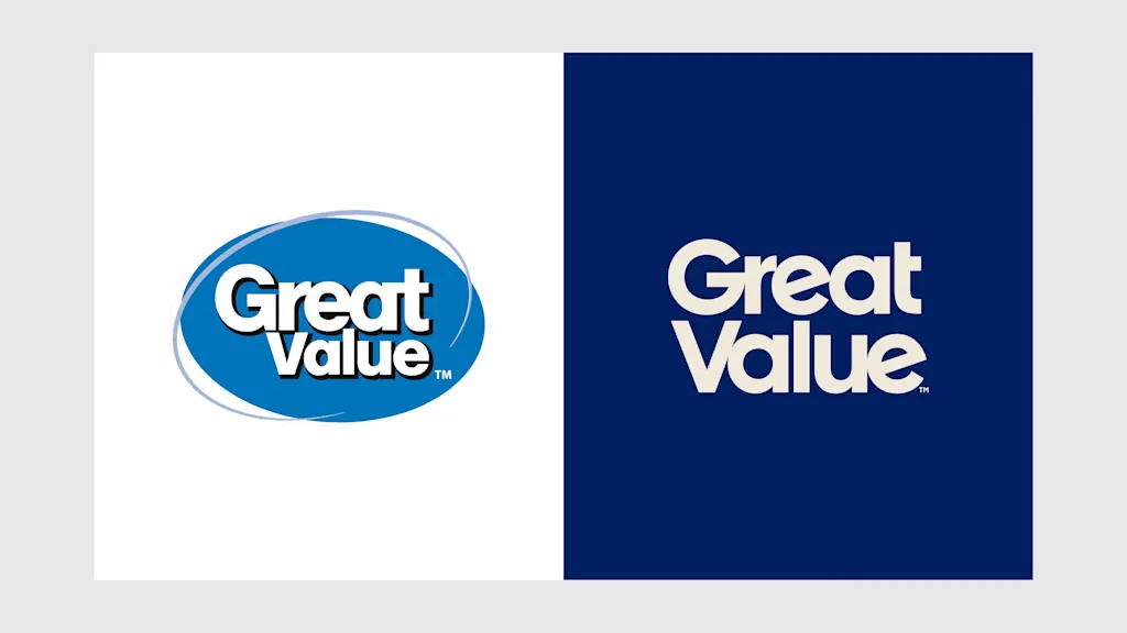
Walmart’s internal creative team was responsible for every part of the redesign, including redrawing the Great Value logo from scratch in a bespoke typeface. It’s larger and more prominent on the packaging, and it comes in a deeper, richer shade of blue than the old version, giving the brand more gravitas. But it’s still within the blue color palette that Walmart is known for.
The team tightened up the typography, with careful attention paid to details that most shoppers will never consciously register: Hartman mentions the angle of the two E’s in “Great Value,” which creates a subtle linking shape, like the hint of a smile.
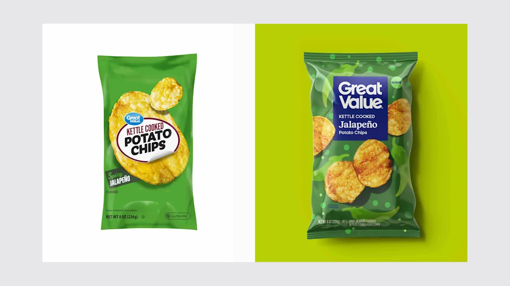
But the team was also interested in making sure the packaging communicated important information clearly. Nutrition information is now consistently placed in the upper right corner across all food items, with a color-coded tab system—yellow for key facts—making it easier for shoppers to quickly parse what they’re grabbing, whether they’re in the aisle or scrolling through the app.
“We believe great design should be accessible to everyone,” Hartman says. “At our scale, that means creating something that works clearly and intuitively across thousands of individual items so customers can find what matters, faster.”
Morris argues that Walmart has spent decades developing its reputation for offering consumers the lowest prices on the market, so it no longer needs to use the packaging to communicate that these products are inexpensive.
“We don’t need to make things look cheap to be inexpensive,” Morris says. After all, a product conveys value when it has a sense of being worth your money, and that happens when a brand communicates great quality—at the right price.
Related Posts
Some fast-food chains are making a quiet change to bills as the penny disappears
Food brands are making subtle pricing changes as the US…
One of the most stressful jobs in finance right now: private credit sales
AnVr/Getty Images Private credit's push into retail investors created hundreds…

Trump is set to announce a ‘very respected’ nominee to lead the Federal Reserve
President Donald Trump said he plans to announce his choice…